Analysis Framework
How raw research data became structured insight — coding, affinity diagramming, the Lextant framework, and the translation to drivers.
Section 3.1
Coding scheme
Six-step pipeline from raw transcripts to clustered stickies. Color-coded by layer; bias-controlled at the matrix step.
Pipeline
Raw data → affinity wall, in six moves
- Raw transcripts + notes + photos + video
- Highlight extraction
- Quote attribution (verbatim)
- Research matrix population
- Sticker coding
- Affinity diagram clustering
Highlight extraction
For every interview, cultural-probe debrief, and sensory-cues intercept, the interviewer extracted 3–7 numbered insights from the raw recording. Insights had to be:
- Self-contained — readable without the surrounding transcript.
- Specific. ‘Discoverability is hard’ is not enough; ‘5 of 5 participants failed to surface the robot option in their default delivery app’ is.
- Attributable. Each insight is owned by a single matrix row.
Quote selection
1–3 verbatim quotes per interview. Selection criteria:
- Compresses a finding into the participant’s own words.
- Surprises. Quotes that confirm what we expected made the cut only if they confirmed something the team hadn’t fully internalized.
- Attributable — interviewer and interviewee always named.
Research matrix
The matrix is the single source of truth for the rest of the project. Every insight and every quote in the client book traces back to a matrix row. See § 6.1.
Sticker coding
Each insight rewritten as a single sticky note for the affinity wall. Color carries semantic meaning (see legend below). The three-layer convention forces every group to have a contrast between what is and what should be, with quotes anchoring both.
Clustering
Stickies were posted under the seven thematic columns. Where a sticker fit two columns, it was placed in the dominant one and cross-tagged. Final wall: § 3.2.
Sticker color legend
Color carries meaning on the affinity wall
| Color | Layer | Content |
|---|---|---|
| Green | Header | Seven thematic columns (App, Hand-off, Environmental, Pricing, Restaurant, Branding, Overall perception) |
| Pink | Ideal | What an ideal experience looks like (in first person) |
| Blue | Current state | What today’s reality is (in first person) |
| Yellow | Raw | Verbatim or near-verbatim quotes, with attribution |
Tools used
- Figma + FigJamAffinity wall.
- Google SheetsResearch matrix master.
- Lextant templateDOCX + SVG, in _archive/lextant-framework-files/.
Bias controls
- Two-coder checkVicente + a second team member reviewed each ‘✓ done’ matrix row before it was finalized.
- Verbatim quote checkQuotes were re-listened to before being posted publicly.
- Naming checkNo name appears in the public matrix without participant consent.
Section 3.2
Affinity diagram
Seven thematic columns × three layers (ideal · current · raw). The gap between pink and blue is the design opportunity.
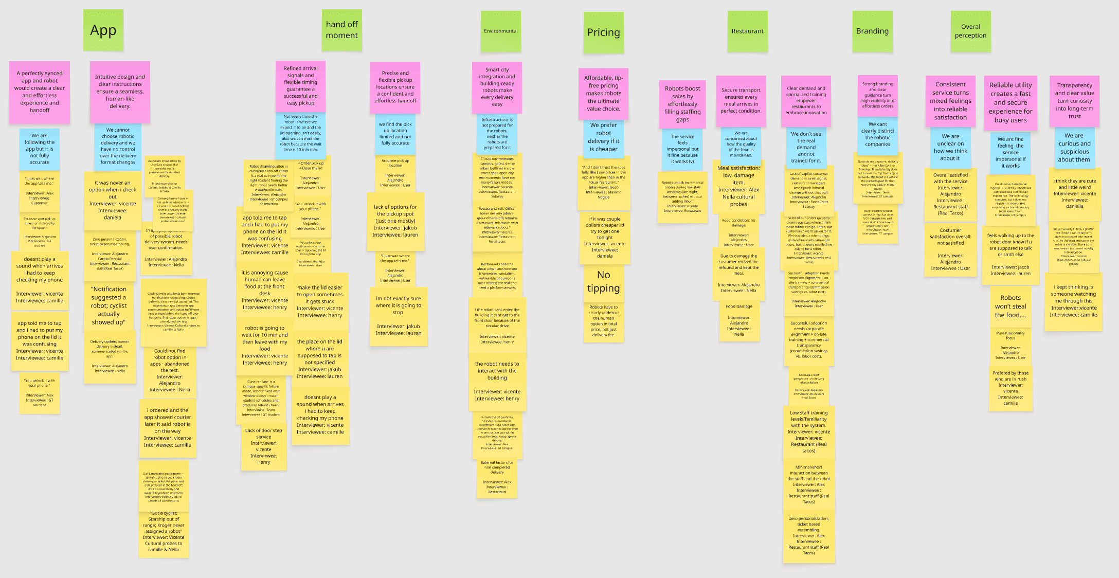
How to read this diagram
Three layers per column. The gap is the design opportunity.
The biggest gap, unsurprisingly, sits in the Hand-off moment column — which validates the project’s scope. But the App column is just as loud: the failure begins long before the robot arrives, because users can’t even reliably opt in.
App
Ideal
“A perfectly synced app and robot would create a clear and effortless experience and handoff. Intuitive design and clear instructions ensure a seamless, human-like delivery.”
Current state
“We are following the app but it is not fully accurate. We cannot choose robotic delivery and we have no control over the delivery format changes.”
Quotes (9)
- I just wait where the app tells me. — Alex / Customer.
- Doesn’t play a sound when arrives, I had to keep checking my phone. — Vicente / Camille.
- App told me to tap and I had to put my phone on the lid, it was confusing. — Vicente / Camille.
- You unlock it with your phone. — Alex / GT student.
- Got a cyclist; Starship out of range; Kroger never assigned a robot. — Vicente / Cultural probes (Camille & Nella).
- Notification suggested a robot; cyclist actually showed up. — Alejandro / Nella.
- Could not find robot option in apps — abandoned the test. — Alejandro.
- I ordered and the app showed courier later. It said robot is on the way. — Vicente / Camille.
- 5 of 5 motivated participants — actively trying to get a robot delivery — failed. Adoption isn’t a UX problem at the hand-off; it’s a discoverability and availability problem upstream. — Vicente / Cultural probes / all participants.
Hand-off moment
Ideal
“Refined arrival signals and flexible timing guarantee a successful and easy pickup. Precise and flexible pickup locations ensure a confident and effortless handoff.”
Current state
“Not every time the robot is where we expect it to be, and the lid opening isn’t easy. We can miss the wait time as it’s 10 min max. We find the pickup location limited and not fully accurate.”
Quotes (10)
- Order pick up / Close the lid. — Alejandro / User.
- You unlock it with your phone. — Alejandro / User.
- Robot disambiguation in cluttered hand-off zones is a real pain point: the right student finding the right robot needs better visual / audio cues. — Alejandro / GT campus observation.
- It is annoying because human can leave food at the front desk. — Vicente / Henry.
- Make the lid easier to open, sometimes it gets stuck. — Vicente / Henry.
- Robot is going to wait for 10 min and then leave with my food. — Vicente / Henry.
- The place on the lid where you are supposed to tap is not specified. — Jakub / Lauren.
- Doesn’t play a sound when arrives, I had to keep checking my phone. — Vicente / Camille.
- ‘Class run late’ is a campus-specific failure mode — robots’ fixed wait window doesn’t match student schedules and produces refund churn. — Team / GT student.
- I’m not exactly sure where it is going to stop. — Jakub / Lauren.
Environmental
Ideal
“Smart city integration and building-ready robots make every delivery easy.”
Current state
“Infrastructure is not prepared for the robots, neither the robots are prepared for it.”
Quotes (6)
- Closed environments (campus, gated, dense urban beltline) are the sweet spot — open city environments have too many failure modes. — Vicente / Restaurant Subway.
- Office-tower delivery (above-ground hand-off) remains a structural mismatch with sidewalk robots. — Vicente / Restaurant R'eal Tacos.
- Restaurant concerns about urban environment (crosswalks, vandalism, vulnerable populations near robots) are real and need a platform answer.
- If the robot can’t enter the building, it can’t get to the front door because of the circular drive. — Vicente / Henry.
- The robot needs to interact with the building. — Vicente / Henry.
- Outside the GT geofence, Starship is unavailable. Mainstream apps failed to deliver even when the user was within plausible range. Geography is destiny. — Alex / GT campus.
Pricing
Ideal
“Affordable, tip-free pricing makes robots the ultimate value choice.”
Current state
“We prefer robot delivery if it is cheaper. The service feels impersonal but it’s fine because it works.”
Quotes (3)
- And I don’t trust the apps fully. Like I see prices in the app are higher than in the actual restaurant. — Jacob / Maximo Nagele.
- If it was a couple dollars cheaper I’d try to get one tonight. — Vicente / Daniela.
- No tipping — robots have to clearly undercut the human option in total price, not just delivery fee.
Restaurant
Ideal
“Robots boost sales by effortlessly filling staffing gaps. Secure transport ensures every meal arrives in perfect condition. Clear demand and specialized training empower restaurants to embrace innovation.”
Current state
“We are concerned about how the quality of the food is maintained. We don’t see the real demand and not trained for it.”
Quotes (8)
- Robots unlock incremental orders during low-staff windows (late night, between rushes) without adding labor. — Vicente / Restaurant.
- Meal satisfaction: low, damage item. — Alex / Nella cultural probes.
- Food condition: no damage. — Alejandro / User.
- Due to damage, the customer received the refund and kept the meal. — Alejandro / Nella.
- ‘A lot of our orders go up to towers way past where I think these robots can go. Three, our customers haven’t asked for it.’ — Vicente / Restaurant (R'eal Tacos).
- Successful adoption needs corporate alignment + on-site training + commercial transparency. — Alejandro / User.
- Low staff training levels / familiarity with the system. — Vicente / Restaurant (R'eal Tacos).
- Zero personalization, ticket-based assembling. — Alex / Restaurant staff (R'eal Tacos).
Branding
Ideal
“Strong branding and clear guidance turn high visibility into effortless orders.”
Current state
“We can’t clearly distinguish the robotic companies.”
Quotes (2)
- Students see a generic delivery robot — not ‘Uber Eats’ or ‘Starship.’ Brand identity does not survive the trip from app to network. — Team / cultural probes.
- Robot visibility around campus is high, but does NOT translate into Uber Eats users — they don’t know how to actually order one. — Vicente / GT campus.
Overall perception
Ideal
“Consistent service turns mixed feelings into reliable satisfaction. Reliable utility creates a fast and secure experience for busy users. Transparency and clear value turn curiosity into long-term trust.”
Current state
“We are unclear on how we think about it. We are fine feeling the service impersonal if it works. We are curious and suspicious about them.”
Quotes (9)
- Overall satisfied with the service. — Alejandro / Restaurant staff (R'eal Tacos).
- Customer satisfaction overall: not satisfied. — Alejandro / User.
- I think they are cute and a little weird. — Vicente / Daniela.
- Feels walking up to the robot, don’t know if you are supposed to talk or something else. — Jacob / Lauren.
- I kept thinking, is someone watching me through this? — Vicente / Camille.
- Initial curiosity / 4 photos taken — visible interest for Instagram, but does not convert into repeat use. By the third encounter the robot is invisible. — Vicente / Cultural probes.
- Pure functionality focus. — Alejandro / User.
- Preferred by those who are in a rush. — Vicente / Camille.
- ‘Robots won’t steal the food.’ — recurring positive sentiment across multiple interviews.
Section 3.3
Lextant framework
The circular Ideal Experience framework — three concentric axes (I feel · I am · It…) plus an outer sensory-cues layer.
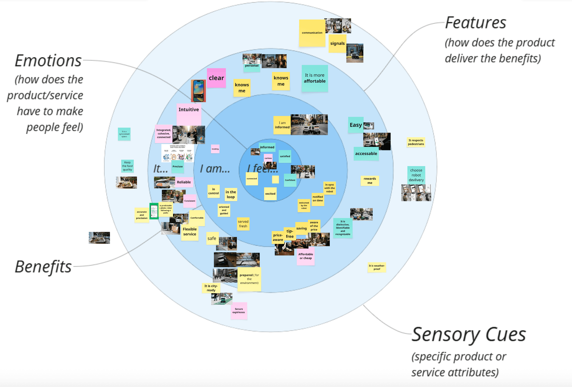
Three concentric axes + sensory cues
Desirability of an offering, organized
The multi-sensory signals (sight, sound, touch, social-gaze) the user picks up during the experience.
How we populated the framework
From affinity wall to drivers, in four moves
- Extract emotional driversFilter affinity stickies through the three-axis filter — anything starting with ‘I feel…’ becomes an emotional driver, ‘I am…’ a benefit, ‘It…’ a feature.
- Map onto the diagramPlace each driver on the circular diagram, anchored to the persona it came from.
- Tag sensory cuesTag the multi-sensory signals (sight, sound, touch, social-gaze) detected during sensory-cues intercepts and connect each cue to the driver it intensifies or contradicts.
- Gather visual triggersPair each driver with photos from the fieldwork that visually represent it. These become visual triggers for the design team.
Why this framework
The Lextant framework turns affinity-wall sprawl into a single artefact a designer can act on. It compresses dozens of stickies into ~12 named drivers, each anchored in research, each with sensory cues attached — the bridge from “what people said” to “what should we design”.
Section 3.4
From data to drivers
The translation rule. Raw quotes don't ship — drivers do. Each driver is anchored in ≥ 2 matrix rows, expressible in first person, tied to a sensory cue or behavioral signal.
The rule
What makes a quote a driver
Raw quotes don’t ship — drivers do. A driver must:
- 1.Originate from at least 2 matrix rows. A single participant isn’t enough to name a driver.
- 2.Be expressible as one sentence — ‘I feel…’, ‘I am…’, or ‘It…’.
- 3.Tie to a sensory cue or a behavioral signal, not a hypothesis.
- 4.Differentiate the experience. If the driver applies equally to any food delivery service, it isn’t a robotic-delivery driver.
Worked example
“I feel watched, but unseen.”
Source rows
- Row 6 (Camille): “I kept thinking, is someone watching me through this?”
- Row 8 (Lauren): “Feels walking up to the robot, don’t know if you are supposed to talk or something else.”
- Row 13 (sensory cues, GT campus): “On the sidewalk, there is no signal that says ‘I am working,’ ‘I am waiting for someone,’ or ‘I belong to this brand.’”
Sensory cue
Visual silence. The robot has no expressive surface. Sight cue is dominant; sound cue is absent.
Behavioral signal
Hesitation at approach. Customers slow down, look around, then walk up.
Design implication
Two-way social signaling — the robot needs to acknowledge the customer is approaching, and the customer needs to know the robot acknowledges them. Could be light, sound, motion, or on-screen content.
Visual triggers
2–4 photos per driver
Every driver is paired with 2–4 fieldwork photos that visually represent it. Photos are dropped intoassets/images/visual-triggers/<driver-slug>/and referenced from the Ideal Experience pages. Their role is to give the design team an immediate, sensory anchor for each driver.
How drivers feed § 4
Lextant axes ← matrix rows
- I feel←rows 6, 8, 9, 12, 13 → Emotional ramp
- I am←rows 5, 7, 8 → Identity / capability
- It…←rows 1, 2, 4, 7, 11 → Features
The fourth layer — sensory cues — comes from row 13 (the intercepts) and the photo trigger board.
Output target
The Ideal Experience section (§ 4) ships ~12 named drivers, each with: source rows, sensory cue, design implication, and 2–4 visual triggers.
Up next
Section 4 · Ideal Experience
The populated Lextant framework — what the customer feels, becomes, and demands when the handoff actually works.